Privacy policy

Tim Holtz Entomology dies and stamps

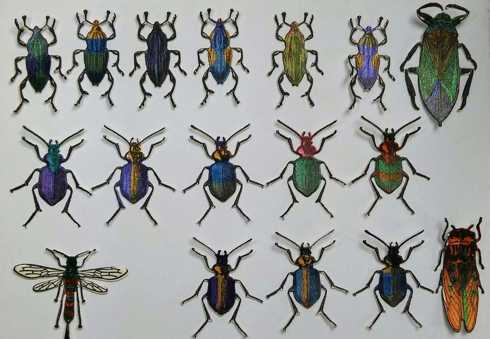
I was excited when Tim Holtz brought out the Entomology stamp set not only did it have a really useful text stamp it had lots of insect that look like they were taken from vintage engraved illustrations. I have posted a  bug box project made with the set. I was quite happy to fussycut this single bug but it would have been very easy to chop off a leg or two so I am delighted Tim has brought out a set of Framelits to go with this set. I have been playing and experimenting for most of this week in my spare moments. I thought I would share a few tips and lots of lovely bugs before they crawl off into a project.


I tried the bee first as who doesn't love bees. I wanted to see if it worked with just the normal two plates in a single pass. As I expected it did not cut cleanly but you are recommended to use a precision plate with intricate dies and these are very intricate. Next I used my Bigshot and a Cherry Lynne metal precision shim plate.  I cut all of the bugs in a single pass. They all cut perfectly with no difficulty popping them out.


I cut out eight more bees and each one worked perfectly. The dies are amazing my best buy in ages.


To get the best alignment for all the legs and antenna use the tiny holes at the end of each one and try and line them up so you see black through every hole. This worked perfectly 98% of the time. Any tiny white edges can be inked with a touch of distress black soot. I wanted to see them coloured so I got out lots of different paints, and Perfect Pearls. On a piece of cream card I drew around the dies and painted lots of the bodies. Once they dried I stamped over them and ran them through the big shot using the framlits. It is hard to colour them this way and achieve perfectly placed colours but I did want to try out lots of the materials I had.


A more precise colouring is possible if you stamp in black archival ink, heat emboss and then colour with markers or use a fine brush with inks or nice fluid paint.


Now I have a bug collection to play with.


Scrapcosy card


This card is an opportunity to use a stamp set by Scrapcosey/Paperartsy.  Scrapcosey (or Raquel) has some great videos on her blog and YouTube using infusions and embossing powders I love her cheerful friendly tone and her stamp sets have lots of vintage illustrations which I am drawn to. I love the vintage plant illustrations in this set and all the map elements. Not sure what it is about old maps that makes them so popular. Perhaps it is the sense of a time when the whole world presented an opportunity for adventure and exploration. That and the great skill in all those illustrations full of tiny details. 


My favourite stamp in the set is the flower. The watercolour paper on the whole card was first lightly tinted with spun sugar distress ink. After stamping the two decorative oval map images I played around with some tape to mask a central area that resists the green ink and creates three distinct areas. I stamped some of the map and plant images in sepia and potting soil archival ink. I also used a small Latin text background stamp to add more texture to the side panels. I used Ranger Rock Candy Crackle paint on the two side panels leaving the surface of the centre matte. This highlights the lovely flower image.


I like the way the rock candy distress crackle changes the colour of the Sepia archival ink I used. It is a darker and almost red under the shiny surface. 

The finished card front is mounted on rust coloured cardstock and a card base made from green cardstock.


I can't remember when I last made something with no embossing round the edge!

Catch up cards on my desk

Just sharing my desk with the ladies at 'Whats on Your Workdesk Wednesday'. Chaos reigns as I make a stack of cards for my kids to use. They are often looking for a card bit my vintage cards do not appeal so I have taken an evening to make some basic fun cards for them to use.


They are all made with an old Stamping up set I bought on eBay for just this sort of quick fun birthday cards.

link for WOYWW

Playing with alcohol ink and WOYWW

Having a great time mixing up all my alcohol inks. They are lined up here like sweeties in a shop.


I'm working on a glass shelf I salvaged from our fridge which died this Christmas. I saved it thinking it might come in handy in my studio and its proving fantastic for this. The colours are so vibrant Having a ball just inking up old photo paper from a long out of date printer. It is turning into a recycling day! As the ink goes so far and the paper was salvaged from the bin I am free to play as much as I like. Once I have made a stack of these I will hopefully have my alcohol lift ink and be able to try it out on all these different colours.

Hope you are all having fun and thank you for all the lovely comments on the blocks last week.

linking up to WOYWW check it out if you have never been there.

Baby Blocks all Wrapped Up

Just putting up the baby blocks as a few people wanted to see them finished.


Yes I only finished two sets, I left the third until we visit that baby as I was itching to get out my embossing powders.

Linking up to WOYWW at Stamping Ground

Deep Sea Collage


The latest paper artsy challenge is "Baked Texture" which inspired me to get out my embossing powders and play. I love using embossing powder. it is like a form of alchemy turning dull grains into molten reflective magic. I love the unpredictable and invisible process of applying virtually invisible Versamark and then coating and melting the granules to discover what will happen this time. Anyone who has visited me much knows I love the new baked texture powders by Seth Apter and Emerald Creek. I only have Deep Sea and Vintage Beeswax but I have mixed in a few of my other powders to create different effects. First I covered the baseboard with a few scraps of sea themed paper and Paperartsy fresco paints in blues and greens. I misted a little dark green from an old ink spray that usually produces big splotches. There are a few dark speckles on the final piece but most of the base colours are not very visible and I didn't take photos, sorry. I was only intending to play a little when I started out. I have include lots of pictures of all the effects and details.


I knew I wanted to use the beeswax and deep sea. I had the blue book spine and the shell and two fish scraps. I tore out several nautical pages from an old almanack. I also inked a piece of seam binding and stamped some text onto it and I used one tiny piece of design tape. I stained and glued down some pieces of the book paper and then applied some rock candy in some areas to create crackle . While it dried I stained and embossed some of the book paper fragments.


Each piece of book paper ended up with a very different look with all the various media used. The top fish is sitting on a piece that had 3 coats of beeswax. The bottom one is on a piece stained with distress stain.


This piece has only one coat of the vintage beeswax. The pale blue under the beeswax is a touch of blue distress stain. You can see the deep sea baked texture clearly here at the top.


All the heating the embossing demanded was too much for the rock candy and some of it flaked off. You can see the effect above in the bottom left hand corner. It just added to the sea texture so it looked quite good. I used a coat of beeswax then a coat of the sea embossing mixture to create a deep blue sea under the bottom fish. The 'Sea mixture" is lots of Deep Sea Baked texture, a pinch of Wendy Vecchi Fern green and Sky blue and a slightly bigger pinch of Ranger Antiquities Verdigris. 


I love the way different elements float and emerge in and out of focus. The different coloured layers all affect each other just like underwater. The Deep sea under the Vintage Beeswax is much greener. The blue area at the top of this picture is  Deep Sea baked texture under the Vintage Beeswax and on top of blue distress stain. It is very hard to describe any collage without using terms associated with water drift, float, swim all work so well to describe the way the elements and layers sit together and move between each other. 


In this section the gilt publishing company name on the old book spine glimmers just under the fishes tail. I had not noticed when I began that the publishing house was called Nelson! The book paper lists the tides and Rear and Vice Admirals in keeping with the nautical theme.


I wanted to use antiquing cream to emphasise the cracks in the rock candy and create a contrast to all the creams, greens and blues. Red Oxide ended up suggesting coral which was a pleasant surprise.


I thought the whole panel was too dark so I added a touch of white. After randomly sprinkling in a few spots I added individual specks of white from a pot of Stampendous Frantage to create bubbles for the fish.


Adding this to:
Paperartsy challenge #14 Baked Texture
Country View Crafts Challenge Sun Sea Sand
Emerald Creek Great Outdoors #ECAUG2018
That's Crafty Animal Magic challenge


Embossed Magic Card

My second embossed card uses my all time favourite Vintage Beeswax embossing powder. This powder adds a yellowy translucent tone that ages any paper perfectly it looks textured and all the bumps catch the light beautifully.


I used the same technique on this card as the robin egg card but this time I used the Seth Apter/ Emerald Creek's Vintage Beeswax embossing powder on the raised embossed areas. It completely changes the tone of the paper. It is much darker and richer looking. The beeswax has a very different effect to the normal clear powder I used on the Robin egg card. it really does add a yellow wax encaustic look. Adding a single layer on the 'Magic Garden' element gives it texture as well as deepening the colour  of the paper.


I was tempted to emboss the little boy but I didn't want every element to have similar tones. I also left the book paper fragment with just a hint of green ink and no embossing. I have had a great time experimenting with the resists that embossing offers Vintage beeswax really is magic! I am off to play with my Deep Sea powder now . . . watch this space.


Im linking this to Paperartsy's Baked Texture challenge