Only those who buy all their Christmas cards think it is too early to be getting ready for Christmas.
I made my first Christmas card and my desk is covered in Christmas stamps, lots of silver, white and gold shiny stuff. I love all of the Christmas preparation and card making is usually my first task. I am trying to move away from green and red this year.
Ive used Oxide Distress in Antique Linen and a Tim Holtz stencil to add turquoise stars to the background. I used a mask to keep an area in the card clear where I wanted to stamp an image. I stamped the Lynne Perrella lady onto the card front using a mask I gave her some wings decorated with a hint of grey and a touch of blue sparkly Stickles. I also added sparkle to the stars in the background. I always get my Stickles out at Christmas and the room is covered in lots of drying, sticky, glittery decoration. I added a sentiment from Tim Holtz 'Simple Sayings" stamp set. Finally some embossing powder in Shabby blue and frozen lake (by Stampendous) and a tiny touch of gold embossing to edge the grey mount card and sentiment.
I have just noticed a bit of bare card in the corner at the top of my card which I will have to touch up.
Imagine Autumn
I made the background with heavy watercolour cardstock and used oxide inks to add a base colour. Then I used several Inkylicious plant stamps which I clear embossed to give some texture. Ive also inked some speckles and text and of course used some gold embossing powder. This is Ultra high Wow and Ive added a little Paprika to it (also from Wow) The background is mounted on a Kraft card base.
Next I made a handful of Autumn leaves using Sizzix, Susan's Garden 'Woodland leaves' dies. I cut out a few sets in Kraft, yellow and rust card and then smooched them in lots of browns and greens and some Spiced Marmalade inks I used both oxide and regular distress. I scrunched them up a bit to add shape to them. Once they were dry I stamped veins randomly onto them using my old Tim Holtz Falling leaves stamp set.
I then tried a paper doll but I was not happy with it as there was no contrast for all the brown tones. I have taken out all my Christmas supplies this week. After rifling through them I decided these two fairy sisters would add a little colour and allow me to bring out the magic of this season full of change and beauty.
Even better all the work to create them was already done. I made these for our tree two years ago. They were created on the computer then printed out onto card and the wings decorated in Stickles.
These two were one of my favourites. It is nice to give them a special woodland setting all of their own.
Now my fingers are really colourful and I am a happy bunny. Off to visit all my neglected friends in the blogosphere now.
Linking up with:
A Vintage Journey Challenge Autumn Splendor
The Artistic Stamper 8th year Challenge Inktober
Country View Crafts Plant-tastic
Entomology stamps and framlits card
This is my first card using the Tim Holtz Entomology Framelits and stamps.
I used one piece of design tape on the left of the cream card front the whole surface was then covered with brown Paperartsy fresco finish paint. I rubbed it back a little to allow the tape to show through in some areas. Next I used the crackle glaze over the whole card, let it dry and covered it in a coat of eggshell fresco paint. Once the paint had dries and the crackle effect was visible I stamped images onto tissue paper and collaged them on top of the painted surface. I wanted more crackle so I added decoArt Media crackle Glaze over the stamped areas. When this had air dried (after dinner) I rubbed over antiquing cream in Raw Umber and Red Oxide. I removed most of this colour and then used regular distress ink in Forest Moss, Vintage Photo and Rusty Hinge to create an aged wood look and bring out the crackle more. I intended to cover most of the centre of the card so all my attention was given to the edges.
I layered the card with; some of the label embellishments I made earlier and some of my new coloured bugs.
I love the luminescent colours on the largest bug.
The text stamp is stamped onto a piece of old book paper. I folded, rolled and scrunched it up a little inking the edges to suggest a page from an old note book. The card is matted onto some rust coloured cardstock and a brown card base.
I am linking this up to the current More Mixed Media Challenge Anything Goes + Brown
I layered the card with; some of the label embellishments I made earlier and some of my new coloured bugs.
I love the luminescent colours on the largest bug.
The text stamp is stamped onto a piece of old book paper. I folded, rolled and scrunched it up a little inking the edges to suggest a page from an old note book. The card is matted onto some rust coloured cardstock and a brown card base.
I am linking this up to the current More Mixed Media Challenge Anything Goes + Brown
Experimenting with Wax Collage
I requested a Ranger melt pot for my birthday last year. I made a project for an exhibition in a mad rush but I have not experimented since. This year as my birthday approached again I felt I really should get it back in use. I used a piece of off cut wood donated by my husband. I coated it with two layers of encaustic gesso. next I lay out my design.
I put down the first layer of wax let it dry and then fused it by gently heating the layer to bond it to the layer below. Then I dipped the piece of encyclopedia paper into the wax and lay it down onto the surface and coated it in a layer of wax. As soon as this was done I remembered of course the wax made the paper translucent and both sides showed through so it just made a confusing mess.
Just sharing the real process, warts and all! Well the good thing about wax is you can melt it off and start again. So I got rid of this layer and remembered I wanted to try some collage using stamped tissue. The next hour was spent choosing and stamping a collection of nature images onto some regular tissue. I tore all the edges so it would blend into the background more easily. I also wanted to try and experiment with colouring the layers. At this point I became engrossed and took no more pictures. I used oil pastels and rubbed them onto the now waxy board. I Next put a layer on top of the pastel. This did not work well, the pastel pooled giving a patchy effect. I melted and scraped this off and then tried watercolour paint but that just resisted the wax and sat in dots on the surface. I scraped it off and then put all my blue stained wax into the pot. this melted into a nice coloured wax which I used for the rest of my layers.
By this stage I had learnt a lot but was not happy with the results. I wanted a more even surface and the blue over the images made the images disappear too much. The lace embedded in wax was the only element I loved. I do like the colour but I want to achieve a more mysterious effect. Of course at this point it is all learning and I am happy with experimenting with wax for many hours to come.
I decided to go ahead and post and share this experiment. I have requested a few more off-cuts to try again and will post the next experiment.
I put down the first layer of wax let it dry and then fused it by gently heating the layer to bond it to the layer below. Then I dipped the piece of encyclopedia paper into the wax and lay it down onto the surface and coated it in a layer of wax. As soon as this was done I remembered of course the wax made the paper translucent and both sides showed through so it just made a confusing mess.
Just sharing the real process, warts and all! Well the good thing about wax is you can melt it off and start again. So I got rid of this layer and remembered I wanted to try some collage using stamped tissue. The next hour was spent choosing and stamping a collection of nature images onto some regular tissue. I tore all the edges so it would blend into the background more easily. I also wanted to try and experiment with colouring the layers. At this point I became engrossed and took no more pictures. I used oil pastels and rubbed them onto the now waxy board. I Next put a layer on top of the pastel. This did not work well, the pastel pooled giving a patchy effect. I melted and scraped this off and then tried watercolour paint but that just resisted the wax and sat in dots on the surface. I scraped it off and then put all my blue stained wax into the pot. this melted into a nice coloured wax which I used for the rest of my layers.
By this stage I had learnt a lot but was not happy with the results. I wanted a more even surface and the blue over the images made the images disappear too much. The lace embedded in wax was the only element I loved. I do like the colour but I want to achieve a more mysterious effect. Of course at this point it is all learning and I am happy with experimenting with wax for many hours to come.
I decided to go ahead and post and share this experiment. I have requested a few more off-cuts to try again and will post the next experiment.
Back to Nature Autumn tag
I have changed the look of my blog a little so I can use bigger pictures. Pictures are so central to visual work. Today I wanted to experiment with Paperartsy's infusions and grunge paste. I worked on some book pages adhering them to card and cutting out a die from the Tim Holtz Bookplate and tag die. Next I used the paste through a stencil. Once it dried I used a heavy sprinkle and spritz of Slime infusions.
By the time I had finished the text has almost disappeared. I love the range of colours that the infusions create. The texture paste highlighted this effect as the colours pool and swirl around the patterned surface. I did use some distress ink in olive and forest moss but most of the colour comes from the infusions. I added very little to this as I wanted to allow the texture and colour show through.
I used some gold and terracotta embossing powder to create a defined edge. I die cut some tiny leaves from the Tiny Tattered Florals framlits set and finished off with some dark brown Autumn plants from my garden.
This tag is partly inspired by the challenge over at A Vintage Journey where they prompt you to use natural objects, colours and themes this month. It is hard not to be conscious of nature at the change of seasons so much shifting colour and form in the garden as everything bursts its borders and dries out or turns rich browns and golden colours.
The tag is finished off with a quote from Van Gogh.
I am linking up to A Vintage Journey where they are challenging you to get Back to Nature
Also joining in with That's Crafty Forever Autumn Challenge
By the time I had finished the text has almost disappeared. I love the range of colours that the infusions create. The texture paste highlighted this effect as the colours pool and swirl around the patterned surface. I did use some distress ink in olive and forest moss but most of the colour comes from the infusions. I added very little to this as I wanted to allow the texture and colour show through.
I used some gold and terracotta embossing powder to create a defined edge. I die cut some tiny leaves from the Tiny Tattered Florals framlits set and finished off with some dark brown Autumn plants from my garden.
This tag is partly inspired by the challenge over at A Vintage Journey where they prompt you to use natural objects, colours and themes this month. It is hard not to be conscious of nature at the change of seasons so much shifting colour and form in the garden as everything bursts its borders and dries out or turns rich browns and golden colours.
The tag is finished off with a quote from Van Gogh.
I am linking up to A Vintage Journey where they are challenging you to get Back to Nature
Also joining in with That's Crafty Forever Autumn Challenge
Tim Holtz Entomology dies and stamps
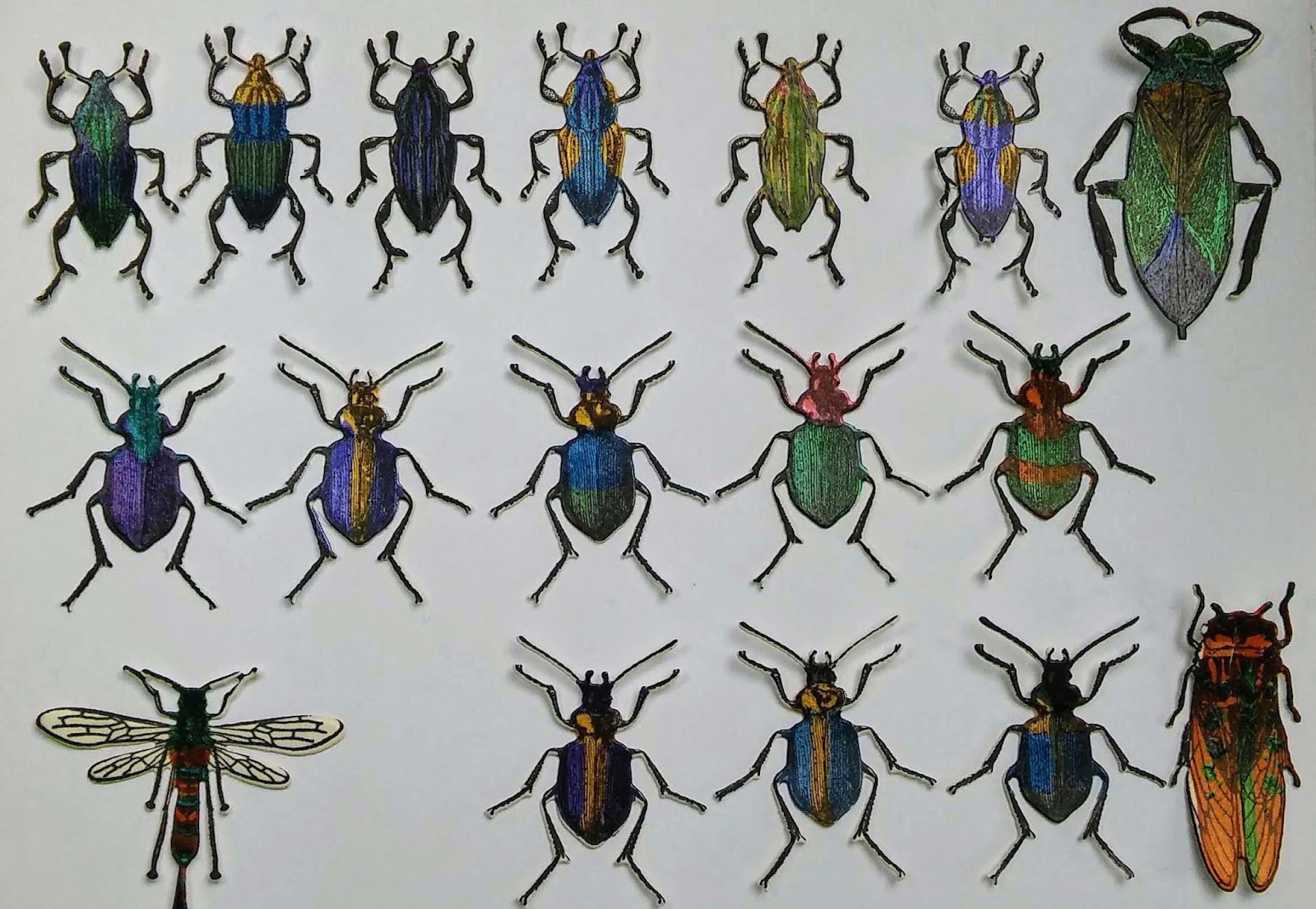
I was excited when Tim Holtz brought out the Entomology stamp set not only did it have a really useful text stamp it had lots of insect that look like they were taken from vintage engraved illustrations. I have posted a bug box project made with the set. I was quite happy to fussycut this single bug but it would have been very easy to chop off a leg or two so I am delighted Tim has brought out a set of Framelits to go with this set. I have been playing and experimenting for most of this week in my spare moments. I thought I would share a few tips and lots of lovely bugs before they crawl off into a project.
I tried the bee first as who doesn't love bees. I wanted to see if it worked with just the normal two plates in a single pass. As I expected it did not cut cleanly but you are recommended to use a precision plate with intricate dies and these are very intricate. Next I used my Bigshot and a Cherry Lynne metal precision shim plate. I cut all of the bugs in a single pass. They all cut perfectly with no difficulty popping them out.
I cut out eight more bees and each one worked perfectly. The dies are amazing my best buy in ages.
To get the best alignment for all the legs and antenna use the tiny holes at the end of each one and try and line them up so you see black through every hole. This worked perfectly 98% of the time. Any tiny white edges can be inked with a touch of distress black soot. I wanted to see them coloured so I got out lots of different paints, and Perfect Pearls. On a piece of cream card I drew around the dies and painted lots of the bodies. Once they dried I stamped over them and ran them through the big shot using the framlits. It is hard to colour them this way and achieve perfectly placed colours but I did want to try out lots of the materials I had.
A more precise colouring is possible if you stamp in black archival ink, heat emboss and then colour with markers or use a fine brush with inks or nice fluid paint.
Now I have a bug collection to play with.
I tried the bee first as who doesn't love bees. I wanted to see if it worked with just the normal two plates in a single pass. As I expected it did not cut cleanly but you are recommended to use a precision plate with intricate dies and these are very intricate. Next I used my Bigshot and a Cherry Lynne metal precision shim plate. I cut all of the bugs in a single pass. They all cut perfectly with no difficulty popping them out.
I cut out eight more bees and each one worked perfectly. The dies are amazing my best buy in ages.
To get the best alignment for all the legs and antenna use the tiny holes at the end of each one and try and line them up so you see black through every hole. This worked perfectly 98% of the time. Any tiny white edges can be inked with a touch of distress black soot. I wanted to see them coloured so I got out lots of different paints, and Perfect Pearls. On a piece of cream card I drew around the dies and painted lots of the bodies. Once they dried I stamped over them and ran them through the big shot using the framlits. It is hard to colour them this way and achieve perfectly placed colours but I did want to try out lots of the materials I had.
A more precise colouring is possible if you stamp in black archival ink, heat emboss and then colour with markers or use a fine brush with inks or nice fluid paint.
Now I have a bug collection to play with.
Scrapcosy card
This card is an opportunity to use a stamp set by Scrapcosey/Paperartsy. Scrapcosey (or Raquel) has some great videos on her blog and YouTube using infusions and embossing powders I love her cheerful friendly tone and her stamp sets have lots of vintage illustrations which I am drawn to. I love the vintage plant illustrations in this set and all the map elements. Not sure what it is about old maps that makes them so popular. Perhaps it is the sense of a time when the whole world presented an opportunity for adventure and exploration. That and the great skill in all those illustrations full of tiny details.
My favourite stamp in the set is the flower. The watercolour paper on the whole card was first lightly tinted with spun sugar distress ink. After stamping the two decorative oval map images I played around with some tape to mask a central area that resists the green ink and creates three distinct areas. I stamped some of the map and plant images in sepia and potting soil archival ink. I also used a small Latin text background stamp to add more texture to the side panels. I used Ranger Rock Candy Crackle paint on the two side panels leaving the surface of the centre matte. This highlights the lovely flower image.
I like the way the rock candy distress crackle changes the colour of the Sepia archival ink I used. It is a darker and almost red under the shiny surface.
The finished card front is mounted on rust coloured cardstock and a card base made from green cardstock.
I can't remember when I last made something with no embossing round the edge!
Subscribe to:
Posts (Atom)